Wednesday, December 7, 2011

Long Time no Blog

No excuses, I just haven't been writing.  I have been playing with Photoshop Elements and working on some picture quotes.  I have a selection of favourite quotes from Mary Anne Radmacher that I've been using in my journal and I decided to use those quotes on 4 x6" cards in my journal and planner.  I've been playing around with some of the features in Elements to create my backgrounds.
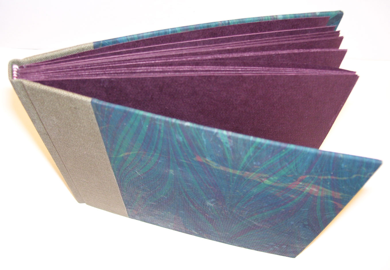
Here is what I've come up with so far:


I still have to put the attribution on the  cards.

Thursday, September 15, 2011

Whimsical Workspaces–free workshop by Rhomany

SATURDAY 1st OCTOBER - SATURDAY 29TH OCTOBER


The Basics

  • Workshop: STUDIO MAKEOVER
  • Weeks - 4 (can be repeated with other rooms later)
  • Begins: Saturday October 1st
  • Price - COMPLETELY FREE! (but donations gratefully accepted on a completely voluntary basis)

First things first...

THIS NOT ABOUT BLITZING!

Blitzing is tiring just to think about, doesn't serve a purpose and isn't enjoyable. Anyone who tells you they love housework gets looked at like they're crazy. We would ALL have cleaners if we could afford it. Let's be honest.

We would all love to have studios that look immaculate and could grace the cover of 'What Home' magazine, but in reality, we're creative. Even if we ever attain our dream studio, the chances are it won't stay that way for very long anyway. And us crafty types tend to hoard stuff. I know I have at least 3 shelves full of scrapbooking stuff I haven't used in... well.... let's just say 'a while'.

So... what is it about then?

This workshop is aimed at turning your workspace from a place you cringe at and think 'now, where did I put...?' into somewhere you can't wait to get into and make stuff in. Whether you work in a dedicated studio, out of a repurposed cupboard or need to find a corner of your home to turn into a little workspace just for you, this workshop will help you create a lovely, nurturing environment for your work. In an easy to manage, fun way that won't overwhelm you.

This is not about cleaning and organising, Get that out of your head. It's going to take a month to sort out your space, working in specific, manageable chunks each day. If you do other rooms after that's longer. I'm hope to do my studio lounge, kitchen, main bedroom, spare room, bathroom & hallway. That's 5 months. That's the end of January which sounds like a long time to be cleaning and organising. But honestly, how much will I get done between now and then by putting it off and making cups of tea? Even if I give up after one room, I will still have accomplished something.

This is about nurturing and creating a sacred, artistic space. If you don't have one, clear out a corner and make one. If you have one, clear out the stuff that's in your way and turn it into somewhere you want to be, that inspires you and makes you happy. While we work on each area we'll do other things we 'never have time to do' like listening to albums we love, listening to an audio book or radio program, moving in a way that encourages your body to stretch, whatever you decide to focus on.

Prompts will be given and maybe a link to one song that sets the theme for the day to bring in some different music that you might not otherwise listen to.

    This sounded perfect to me so I signed myself up.  See that highlighted sentence – I did that.  That is what I want out of this workshop.  I can’t seem to get there on my own without getting totally overwhelmed.  This seems like a good way to spend an hour or two a day for a month.

    100_0965

    100_0966

    100_0967

    100_0969

    You can see why I need some help.  And this is after I spent a couple of hours clearing off the top of the desk.

    Friday, September 9, 2011

    Trying Out LiveWriter

    I’m trying out Windows Livewriter.  I read about it on-line, on Susie Jefferson’s blog to be exact and I thought I’d give it a try.  It is supposed to allow you much more flexibility in writing and publishing blog posts.  I’ve always been irritated by the limited fonts that I’ve had at my disposal.  Not that I want to go all fancy but Verdana is not necessarily what I had in mind.  Sometimes, for some things, you’d like to spice it up a bit. 

    Apparently with Livewriter, I’ll get access to all the fonts that I have on my computer and I have A LOT on my computer.  I’m a bit of a font collector.  Since I’m not very good at hand lettering, I do a lot of computer lettering and transfer that to the work that I do.

    Let’s see how this posts.  Here goes.

    Thursday, September 8, 2011

    Plaster Art

    I've been browsing through the book "Plaster Studio: Mixed Media Techniques for Painting, Casting and Sculpting" by Stephanie Lee and Judy Wise. 

    I've always been intrigued by plaster and used some spackle as a texture medium in paintings but I've never really tried to seriously work with it until I looked at this book and saw that it wasn't as hard as I thought.

    I'd been to my favourite thrift store, Value Village, and found a pair of rectangular framed canvases that begged to be turned into something else.  I was just going to paint over them but they had such a nice simple black frame that I thought they might be perfect for a pair of plaster panels.  I wish I'd taken a before picture because they were just a pale floral prints that seemed a bit washed out.

    I first primed the canvas to give it a bit of tooth and then spread a 1/4" coat of drywall compound over the canvas and let it begin to dry a bit.  When it was still moist but not sticky, I used a variety of items to deboss the compound.  I used a doily for a sunburst effect and a greek key pattern and other line patterns to create texture.  Then I let it dry overnight.

    The next step was to give everything a base coat of acrylic paint.  I used a neutral colour(buff) since I was still undecided at to my overall colour scheme.  My next step was to use red and yellow fluid acrylics over the canvas, blending the colours in some areas.  When this was dry I gave the canvas a coat of sealant (Mod Podge).  I saw this on a You Tube video.  It allowed another coat of paint to be placed on the canvas and then removed from areas with a baby wipe. 

    I added a coat of burnt umber and some more yellow.  I wiped back areas to reveal the original colours.  When I liked my finished product, I once again sealed the canvas with Mod Podge

    Here are my finished pieces:


    Here is a close up of the sunburst detail from the doily.


    Tuesday, September 6, 2011

    Sketchbook Digitized


    I'm so excited!  My sketchbook for the 2011 Arthouse Sketchbook Challenge has been digitized and added to the library.  They did a much better job than I did taking photos.  You can go directly to my sketchbook by clicking here.  There is a page spread missing from the "It's Been a Bad Day" section but I've mentioned it to the support staff so we'll see what happens.  They ask you to look over your digitized book and let them know if anything needs to be fixed.

    Thursday, August 25, 2011

    Album workshop

    On the 19th, 20th and 21st of this month, I attended an Album Structure Workshop hosted by the Southwestern Ontario Chapter of CBBAG.  The instructor, Dan Mezza, is a London area bookbinder and restorer of rare books.  He also teaches most of the Bookbinding core courses for CBBAG.  I am truly lucky that his studio is only an hour away.

    During the three day workshop, we created three different album structures.  The most simple structure was a cased in album with a glued spine.  What made this structure interesting was that instead of the single pages being glued directly to each other, the spine end of the page was folded over 1/2".  This meant the one page was glued to the folded flap of the other.  This allowed the pages to open fully without the stress normally applied to a glued spine.  The folded edges also acted as spacers for the photographs that will be placed in the album.


    Cloth spine and overmarbled paper cover

    You can see the folded section of the page

    You can just see the slight extra thickness at the spine.


    The next album was a stub album.  Each piece of folded paper in the signature was wrapped with a guard and the signature itself was wrapped with three guards.  This made a lot to sew through but the outer guards would end up being the stub that would hold the signature in place in the album. 

    Each signature is sewn separately, the outer guards folded back to form stubs and pressed flat with a bone folder and put under weight.

    The stubs are then aligned and the ends glued with PVA.  This is only a temporary measure.  After the stubs are secure, holes will be punched 5/16" from the joint of the stub and the signature.  These holes, 1/4" apart, will be used to sew the signatures together.  A running stitch is used.  The excess stub is then trimmed away and paper is glued over the stitching line to smooth it out.  We were using a leather spine so we wanted the spine area to be as smooth as possible.

    The trimmed spine was pasted,  and a slight rounding was given to the spine to form a shoulder for the cover boards.  Because these were cut ends the rounding is not exactly like a traditional rounded back.  The spine was covered with muslin which would be glued to the covers for additional strength in the hinge area.


    My signatures are not as aligned as I would have like them to be.  They slipped slightly during pressing.


    Marbled papers and a leather spine were used for the cover.


    The third album was a checkerboard binding.  It is an extremely durable binding used in the early Victorian era.  The pages of the album are made from bookboard and then covered with a heavy paper.  The opening for the photographs will be cut into the paper and a slit at the top will allow the photo to be put into the album.

    This particular binding is durable because the cloth strips that attach the pages together don't attach one page to the next but wrap around pages.  The odd pages are attached to each other.  The even pages are attached to each other.  The two different colour strips on the spine make it easy to see the odd and even page attachments.


    We stained the edges of the bookboard to give the book a more decorative look.  A frame of solid colour paper, similar to that used inside the book was placed on the cover.  Decorative paper was used inside the frame, though a photograph could also have been used.


    I haven't cut out the picture frame, hence the solid interior covering.

    Dan is a great teacher and we all learned a lot.  The wrapping for the checkerboard spine needs concentration until you can see the pattern.  Thank heavens we did it in two different colours.  The original bindings were done with one colour cloth.  I don't know how they kept their odds and evens straight.

    Saturday, August 6, 2011

    Making it Our Own

    We've been in the house for two years now and finally finished getting all the "must get repaired" things done.  You know the things on the Home Inspection report that require attention and "money". 

    At long last we are able to turn our attention to making changes because we want to, not because we NEED to.

    We, my niece and I, started in the spring by removing a large circular garden from the backyard.  Believe me, that still left lots and lots and lots of garden.  I transplanted all the varieties of flowers that I wanted to keep to other gardens and then posted a "Free Plants" offer on Freecycle.org for my local area.  For the next week I had people coming by to dig up plants for their own gardens. 

    Those that remained were removed and the ground rototilled by my nephew-in-law. Kudos to him.  That was a huge job as the garden was at least 15 feet in diameter and some of those plants had been there for years.  He got the area cleared for me and I put down some landscaping fabric and 10 bags of natural cedar mulch.  We moved our  11' x 11' hexagonal gazebo from its cramped place on the cement patio to the new softer spot waiting for it.  Now it's a shady place for our toddler's toys and a rocking chair for her mom to supervise play.  There is a sand box and room for a small wading pool. 

    Next it was time to tackle the inside. 

    We replaced the livingroom window -- the seal was broken on several of the lower panes and it was the only older, "high maintenance" window in the house.  It was replaced with an energy efficient three panel window with decorative pewter accents in the smaller, two side windows.

     We also replaced the front door with a new steel door.  The existing door developed a crack in the lower panel (it was wood) and the only thing between us and the outside world was a coat of paint.  Not terribly secure, never mind its tendency to open in the middle of the night even though it was locked.  I'd get up early in the morning to see light in the front hall (which is unusual when you don't have a window in your door) and find that the wooden door had opened by itself -- with the lock still locked.  The only lock between us and the street was the thumblock on the storm door.  Now we have a lovely insulated steel door, with a small stained glass window in textured, clear glass, and a working lock and deadbolt.  Progress!

    The livingroom had offwhite carpet when we moved it and I knew that it was going to go.  You can't have a cat, a dalmation and a toddler and an offwhite carpet and keep your sanity.  The carpet had some wear before we moved in and after two years, well --- it's a little more offwhite than it used to be.  The front door is the one that sees all the traffic in our house and that's just not a place for offwhite anything.


    Next week, distressed oak laminate is going down in the livingroom and the upper hallway.  That meant I had to get a move on to get the walls painted before that happened.  I didn't take a before picture but I've got an in progress picture that shows the current state of chaos. 


    In order to get ready for the floor and painting, I needed to removed a display unit of 4 x4 cubbies.  You can see some of the double cubbies in the picture.  It was an 1.5" too large to get down the staircase to the lower level (where it is going to be a storage unit in the rec room).  That meant I had to dismantle the entire thing, take it down to the lower level (we are in a four level split) and put it all back together.  Luckily, nothing else in the room is that large!


    The carpet is also being removed from the upper hallway and the stairs.  Laminate is going in the hallway but the stairs are being recarpeted in a child and pet friendly berber.  The bedrooms already have hardwood flooring so that will make the upper level much lower maintenance.


    Those areas received a coat of primer and two coats of paint and are looking pretty good.  I chose Behr Pale Wheat for the livingroom and I love it.  From the first roller strip on the wall I knew it was the right choice for the room.  The front entrance hallway wall is done in Martha Stewart "Graham Cracker Crust".  It makes a nice accent and will look good with the flooring that is going down in the entryway and kitchen -- a fibre floor with a marble like pattern in a gray taupe colour.

    The kitchen got it's first coat of Behr "Hazy Skies" which is a lovely blue/gray that will complement the wallpaper wainscotting.  The previous owners were chair rail crazy.  It's in every room in the house but the bathroom.  I removed it from the livingroom and the hallway and my bedroom (which still isn't painted) but left it in the kitchen.  The new colour gives the kitchen a completely new feel.  Once the second coat is complete it will be time to move the furniture out of the rooms in preparation for the flooring. 

    These pictures show the kitchen withe the old paint colour and junk piled over every surface.  You can tell that these pictures weren't staged.


    The next two weeks will be busy ones.

    I'll post before and after pictures when we're done.

    Thursday, July 21, 2011

    Willowing and Artist Friends Ning Group

    If you love those whimsical ladies in mixed media art and would like to learn how to paint those fabulous faces, then you need to take a look at this site - Willowing & Artist Friends.  It's a ning group run by Tamara Laporte.  It's a very positive, very supportive art group.  I've taken two of her on-line classes and they are fantastic.  Detailed videos, pdf documents, discussions groups and support -- everything that you could ask for.

    Right now she is celebrating her 5000th member and hosting a "massive" giveaway as she calls it.  Now would be a good time to take a look.  There is a button on the right side of this blog or click on the link above.

    Don't take my word for it.  You'll enjoy what you see.

    Monday, July 18, 2011

    2012 Sketchbook Project

    I decided to take the plunge again.  When I took a look at all the wonderful sketchbooks that were sent in last year I felt out of my depth and thought that I had overreached myself by entering my book.  I did enjoy myself immensely during the process though, and that is what should count.  During this past year I was part of a sketching/journalling group with the Southwestern Ontario Chapter of CBBAG that was under the direction of Connie Jefferess and I picked up a number of interesting and useful ideas that I'd like to incorporate into future sketchbooks and journals.

    That, along with a couple of very generous comments from viewers of my sketchbook,  boosted my confidence enough to give it another go.  It's not like it's a competition -- it's just a method of self expression and a chance to share that with others.

    To learn more, check out this link

    Wednesday, July 13, 2011

    Resin

    I was at the Mixed Minded Conference in Kitchener on May 27,28,29 and had a fantastic time learning about resin, encaustic, art journalling and calligraphy.  So much so that I've spent almost all my time since then, reading and researching about these topics.  I've been so involved with browsing sites and blogs and looking at books that I've neglected posting any of the fascinating things that I've learned and found.

    The Resins workshop I took was with Carmi Cimicata, who now writes a blog called Resin Crafts.  We used Envirotex Lite to create jewellery by pouring resin into bezels and embedding charms and other bits of ephemera.  Take a look at the ideas and tutorials that she shares on her blog.

    Here are some videos I found on resin casting and resin papers.
    This is called Fearless Resin

    This is a video by Little Windows  - Embedding Everything
                                                     - Butterfly
    Little Windows Step by Step Guides can be found here.

    I am in the middle of a major workshop overhall at the moment so my work area looks a bit cyclonic and not much in the way of art related activities are taking place at the moment.  I am trying to confine my creativity to the upper reaches of the house by repainting the kitchen and livingroom.  Since this means filling in some small holes and cracks I've been looking at "Plaster Studio - Mixed Media Techniques for Painting, Casting and Sculpting" by Stephanie Lee and Judy Wise.  Just so I'll know what to do with my left overs of course.

    Tuesday, May 17, 2011

    Latest Workshop - Woven and Interlocking Book Structures

    On May 7th, I was in London, ON. at the Langdon Library, attending a class on Book Structures given by Nancy Latchford.  It was interesting to say the least.  It was based on work by Claire Van Vliet and Elizabeth Steiner to make the concertina books stronger at the spine.

    We created our templates for the spine strip and the pages and then put a mockup together to see how the weaving of the spine strip locked the pages into place.  The small triangles cut into the weaving strip held each page locked in place.  The strip was woven through the slots cut into the pages. 


    When we had the structure clear in our minds, we tried a four page book as a sample.  The front and back have a different slot structure from the inner pages.  You can make your book whatever size you like and even add pages to this structure by changing or adding to the length of the spine strip.


    Front of the book

    Inside book & facing pages

    Inside back cover


    The triangle tab was an arbitrary shape, as were the page dimensions.  The tabs could just as easily be circles or any other interesting shape.  

    Sunday, April 24, 2011

    Artist Books

    I am going to be submitting, for the first time, two artist books to an exhibition in London, Ontario.
    I chose a Tunnel Book I made called "Winter Through the Window" and an Accordion Book, "My Garden".

    "Winter Through the Window"
    This is the front cover of the book.  I found a picture frame that looked like a window with shutters.  The dimensions are about 5x7".
    I put lace on the inside of the shutters to act as curtains.

    The window area is 4x6".


    The backdrop and tunnel elements are digital manipulations of pictures from stockxchng.  They are then cut out and added to the panels that are attached to the accordion hinges that form the sides of the tunnel.

    When all the elements are in place, the hinged panels are added to the front and back covers of the book. 

    The view through the tunnel looks like this:

    The quote: "In the midst of winter, I found within me, an invincible summer."

    The distance between the panels give the perception of depth to the elements and a sense of 3D to the scene.

    My second book, "My Garden" is an accordion book with cast paper covers.  I used rubber stamps for the cast paper covers and for the embossed paper flower illustrations that were used throughout the book. 

    The stamps were from Hero Arts.  Clockwise from top left: Large Fabric Design, Butterfly Field, Flower Bird Garden, Silhouette Bells, and Floating Garden.


    You can see that the stamps are the inverse kind where the actual design is left unstamped.  This means that it is an excellent candidate for embossing or casting paper.

    Here is the front cover of the book.
    I used paper pulp from scraps of tag board and other cotton based papers that I use.  I soaked this and rubbed it with my fingers to make a rough pulp.  I did not strain it because I wanted a heavy texture.  I placed the large stamp face down and packed the pulp (after I had squeezed most of the water out by hand) evenly over the surface.  I then used a sponge (not a foam one but a regular cleaning one) to press the pulp into the depression of the stamp and absorb the water.  I would wring out the excess water and continue until most of the water had been removed. 

    I didn't want the pulp that overlapped the stamp to dry curved upwards so I turned the stamp over gently, laid it pulp side down and pressed the edges flat away from the stamp.  When it was possible, I carefully removed the stamp and left the cast paper to dry.  If it did dry with a bit of a curve, I simple gave the back a very light spray of water, straightened the cover and placed it under a light weight to dry again.  (don't get it too wet or place it under a heavy weight or you'll lose your design). 

    I repeated the same process for the back cover.

    For the text portion of the book, I used a poem by Wordsworth.  I used Arches Text Wove paper for the accordion portion of the book and decided where I would place the embossed paper flower illustrations.  I then arranged the text on facing pages.  The text pages were given a wash of colour and the text lightly penciled in.  Later I went back and redid the text in a complementary ink to the colour wash.

    The embossed illustrations were also made using rubber stamps.  Here I used layers of handmade paper that were soaked in hot water and pressed into the indentations of the stamps.  The paper had inclusions, some of which were removed) which can be seen in the final product.  Once again, a sponge was used to apply pressure and to remove excess water.

    Embossed illustrations:


    Here is an example of the watercolour wash with text:


    The entire book looks something like this:


    Each of the first four right hand pages has an embossed floral illustrations, while the left contains lines from Wordsworth's poem.
    Related Posts Plugin for WordPress, Blogger...